Types Of Charts Used In Technical Analysis
What is a chart?
Before we get into the different types of charts used in technical analysis, let’s learn about what a chart is.
Charts are the heart and soul of technical analysis. It is a graphical representation of price information or trading volumes of securities (indices, stocks, Forex etc.) over time. Originally, charts were drawn by hand, but nowadays most charts are drawn by computer. For any security, chart can be easily constructed using the trading terminal provided by a stock broker or other platforms which provide charting options.
Just like all other charts, charts used in technical analysis of securities have two axis, horizontal and vertical axis. Typically, the horizontal or x-axis represents time and the vertical or y-axis represents price or trading volume of the chosen security, corresponding to each time period. Trading volumes refer to the number of shares of a company that were bought and sold in the market on a particular point of time.
The regular charts like the column chart, pie chart, area chart etc. that we are generally use does not work for technical analysis because they display one data point at a given point in time. However, technical analysis requires four data points to be displayed at the same time, because each trading minute/day/week or month has four data points i.e. the OHLC – Open (O), high (H), low (L), and close (C). The only exception to this is the line chart.
Why should you use charts?
Charts are one of the main tools that help a technical analyst to predict about the future price movement in a security. It is like the base of technical analysis. Patterns and trends in the price movement can be identified using charts. Many technical indicators can be applied on the charts which will further help in making a decision on when to buy and sell the security. Charts give a pictorial representation of a security’s trading history.
Types of charts used in Technical Analysis
There are many types of charts that are used for technical analysis. However, the most common charts are — line chart, bar chart, point and figure chart, and candle chart(also called Japanese candlestick chart). Few other charts that you’ll find are Heikin Ashi, Renko, Kagi, Three Link Break, Candle Volume, Equi Volume and Equi Volume Shadow chart. Let’s now understand about them in detail.
Line Chart
The line chart is the most basic chart type and it uses only one data point to form the chart. In technical analysis, closing prices of a security over a specified time frame is the data point used to plot a line chart. On the chart, a dot is placed for each closing price for the specified time frame and all the dots are then connected by a line from left to right. If we are looking at 50 day data then the line chart is formed by connecting the dots of the closing prices of the 50 days.
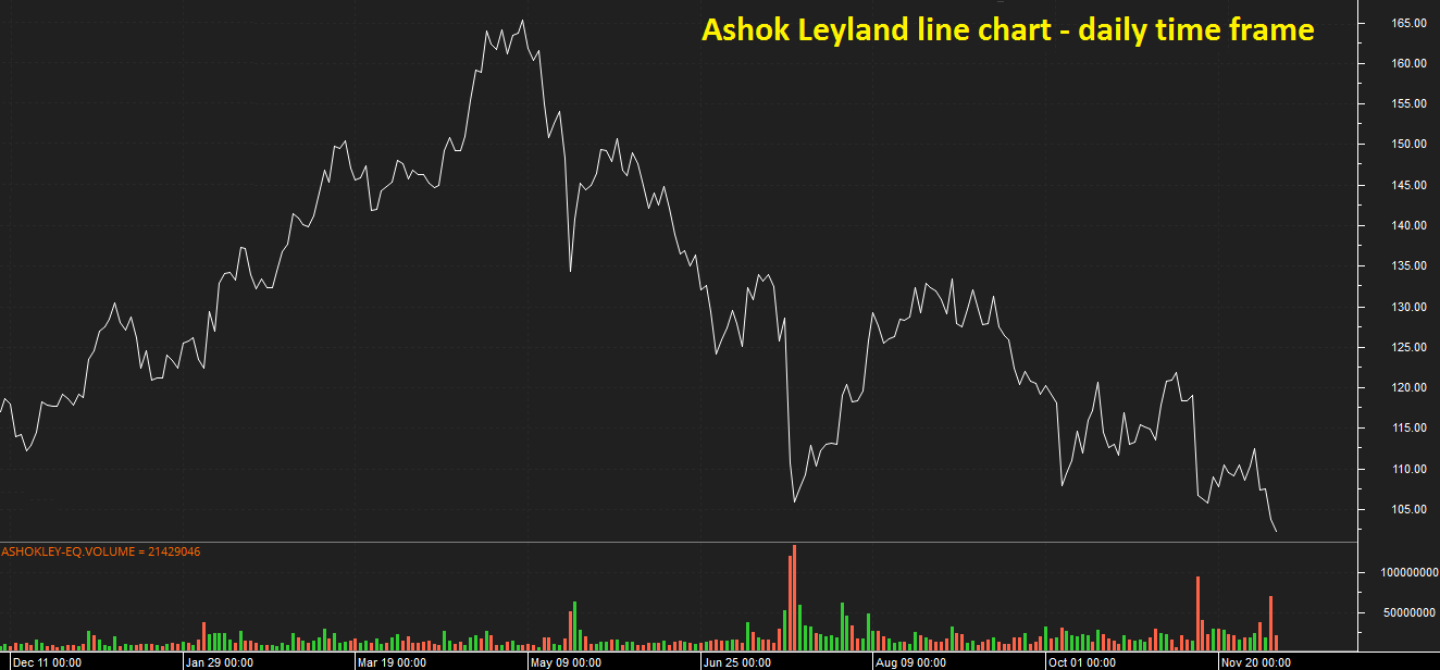
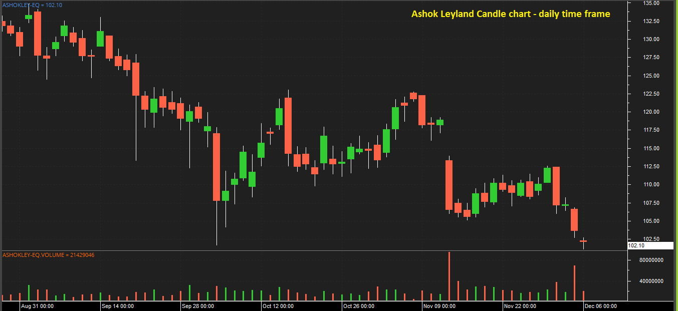
The line charts can be plotted for various time frames namely monthly, weekly, hourly and even in minutes. The below chart of Ashok Leyland is plotted by using daily time frame on x-axis uses and price of Ashok Leyland on y-axis. By close price of each day on x-axis and price. A dot is placed for closing price of each day, and by connecting each of those dots the following line chart is formed.
Advantage: Analysts can identify the generic trend of the security with a single glance.
Disadvantage: Analysts do not get any additional details apart from the generic trend, as the chart doesn’t consider open, high and low price points. However, many traders consider the closing price to be more important than the open, high, or low price within a given period.
Bar Chart
Bar charts are also referred to as OHLC charts as they use all the four price points i.e. open, high, low and closing prices of a security for the selected time frame unlike a line chart which uses only the closing price. Hence, bar charts are made up of a series of vertical lines/bars that represent the price range for a given period with a horizontal dash/tick on each side of the bar that represents the open and closing prices.
Simple put, a bar comprises of the following three components:
1. The verticle line – The top of the line/bar indicates the highest price the security has reached, and bottom end of the bar indicates the lowest price for the specified time period. The length of the bar indicates the range for the same time period.
2. The left horizontal dash/tick – indicates the opening price for the same period.
3. The right horizontal dash/tick – indicates the closing price for the same period.
Note the position of the left and right tick on the bar chart varies based on how the market has moved for the given time frame.
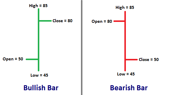
If close/right tick is above the open/left tick it represents a bullish bar. Let’s understand this with the help of the above image. In this case, price of the security opened at Rs.50 during the specified time frame (say for the day), made a low of Rs.45 and went up to make a high of Rs.85 and closed at Rs.80 at the end of the day. It is a bullish day since the price closed above the the opening price. Here the range for the day is 85 – 45 = Rs.40.
(Closing price > Opening price = Bullish bar)
Similarly, the opposite i.e. if the close/right tick is below the open/left tick it represents a bearish bar. Refer to the red bar
(Closing price < Opening price = Bearish bar)

Advantage: Uses all the four price point i.e. OHLC.
Disadvantage: It lacks visual appeal which makes it harder to spot patters and trends.
Candle Chart or Japanese Candlestick Chart
Candlestick charts give the same information as bar charts but differs in the way it looks. The representation of OHLC prices looks like a candlestick, hence the name of the chart. The candlestick, like a bar chart is made up of the following three components.
1. Central real body – The real body is rectangular in shape connecting the opening and closing price
2. Upper shadow – Connects the high point to the close/open depending on the price movement during the specified time frame. For a bullish candle, the upper shadow connects to the closing price while for a bearish candle it connect to the opening price. See the below image for clarity.
3. Lower Shadow – Connects the low point to the close/open depending on the price movement during the specified time period. For a bullish candle, the lower wick connects to the opening price while for a bearish candle it connect to the closing price.
Shadows are also referred to as wicks or tails.
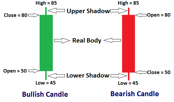
Generally, bullish candles are represented by blue/green/white color and bearish candles by red/black color.
* As technical analysts use charts extensively they’re often referred to as chartists.
The most common time frames that can be used on line, bar and candle charts are:
For medium to long term study: daily or end of day(EOD), weekly and monthly time frames are used
For intraday: 1 min, 2 mins, 3 mins, 4 mins, 5 mins, 10 mins, 15 mins, 20 mins, 30 mins, 1 hour, 2 hours, 4 hours
Scalpers or high frequency traders make use of lesser time frames when compared to others.
Point and Figure Chart
It is completely different when compared to the above three charts. It was used extensively before the introduction of computers for stock analysis. However, it is hardly being used by traders or investors these days because it is complex to understand and provides limited information.
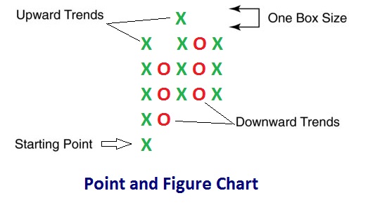
Point & Figure charts consist of columns of X’s and O’s that represent the price movements. Analyst need to set a box size which is the minimum price differential necessary before a price is recorded as an X or an O. The box size can be set to a fixed value or a percentage. X is recorded if the price difference is more than the box size and an O if the price difference is less than the box size.
Analyst also need to set a reversal size that tells how much the price has to move away from the high or low to create a new trend. In other words, how much the price has to move in order for a column of X’s to become a column of O’s, or vice versa. When the price trend has moved from one trend to another, it shifts to the right, signaling a trend change.
There are also numbers and letters in the chart that represent months and giving investors a rough idea of dates.
Each consecutive X is recorded in the same column above the previous X until the price reverses by more than the box size, then a new column is started by recording an O in a box below and to the right of the highest X in the previous column. O’s are added downward with each price decrease greater than the box size until the downtrend reverses to an uptrend, starting a new column where the 1st X is placed in the box above and to the right of the last O in the previous column.
Example, if the box size is considered 1 point, then if a stock rises from 10 to 11, it is recorded as an X because the price rose by at least 1 point. If the stock rose only 0.50 i.e. from 10 to 10.50, then it would not be recorded since the price increment was not at least the box size of 1 point. If the price increased by at least 1 point the next day i.e. from 11 to 12, then another X would be recorded above the previous one in the same column.
If the next day, the price declined by 0.25 i.e. from 10 to 9.75, then nothing would be recorded, since the change is less than the box size. On the following day, if the price declined by more than 1 point i.e. from 9 to 8, then a new column of O’s would be started with the 1st O recorded one box below the top X of the adjacent column. Each time the price declined by more than the box size, then another O would be placed below the last O of the column. When the stock rises by more than the box size, then a new column of X’s would be started, with the 1st X placed one box above the bottom O of the adjacent column.
– The chart essentially displays the volatility or movement in a stock’s price over a chosen time period. It reflects price movements without time or volume concerns, which helps remove noise or insignificant price movements that can mislead a trader’s view on the overall trend. These charts also try to eliminate the skewing effect that time has on chart analysis. P&F charts simplifies the drawing of trend lines, and support and resistance levels.
Since time is not a factor in the chart, no movement in price implies no change in the chart.